I love photography. It’s right up there next to my love of horses. Naturally, I combine the two whenever possible.
I have been working at it for a while, and as I learn more, my photos are getting so much bettter. I’ve studied it, practiced, and followed others good advice, and it feels like there’s still so much more to learn. I will always be a student of photography, but I have noticed certain trends emerge that make good photos.
There’s always exceptions to every photography rule, but the idea is to know the general rules that make a good photo, and then you can break them.
With that in mind, here are a few things I use for my photography.
Keep it Simple
Your horse is looking super cute, so you take a step back, and pull out your phone. You snap the picture, and look down at it, and there’s his cute little face. But, there’s more than just your horse’s cute face in it. There’s also the grooming kit behind him, your saddle on a rack, a wheelbarrow as someone is mucking a stall, maybe even some people standing there, a row of stall doors, several horse heads hanging out of them. In short – dozens of things distracting from your horse’s cute face.
All these distractions cause your photo to lose it’s focus, and therefore, it’s impact. It’s visual clutter, and the viewer has no idea what to look at, or sometimes why you even took the photo.
To create photos with greater visual impact and a clear subject, keep the amount of elements in the picture to 5 or less. In the above scenario, it could be the horse’s head, the stall behind him, and the saddle, and then cut everything else out. Try taking the photo from a different angle, or even moving to a different location to hide clutter behind your subject.
2. Ground
3. Trees
2. Ground
3. Fence
4. Gate
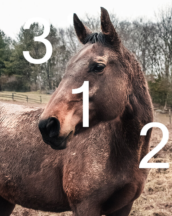
You could also just crop out the extra. See the below example. It’s a photo of Stu and Berry. It’s an okay photo, I think I put it on Instagram exactly like this.
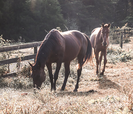
But if I had thought about it more, I would have cropped Stu out.

I personally think Berry grazing is a stronger photo by itself. Berry is the subject of the photo, there’s many other elements present, therefore Stu is just a distraction. If Stu had been grazing as well, I think it could have been a good addition to the photo, but since he isn’t, he adds nothing to it.
Exception: When you’re specifically trying to show how busy the environment is, or all the elements are related, or you’ll know it when you see it.
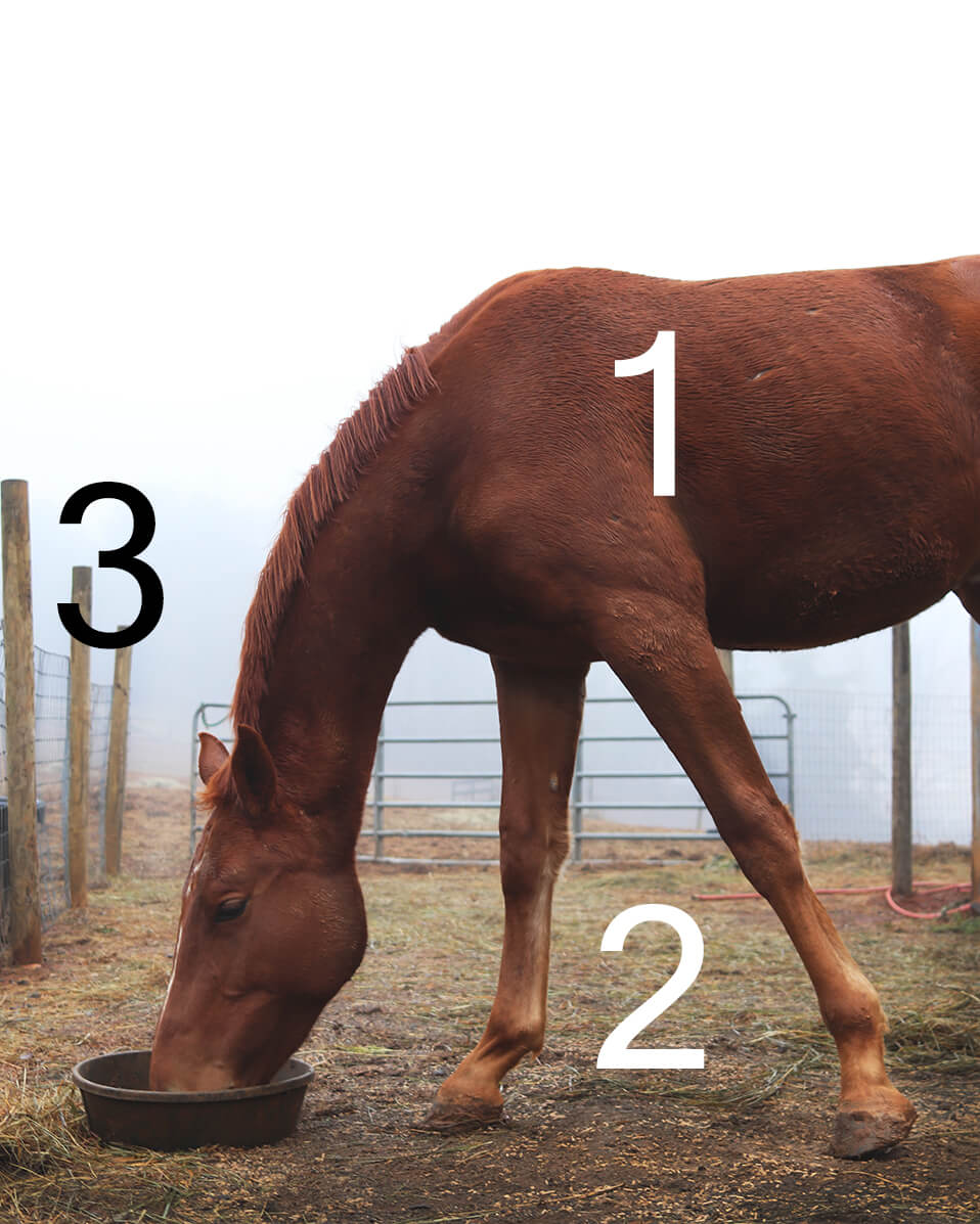
The Rule of Thirds
Most people have heard of this one – basically imagine your photo had four sets of lines running across it, diving up the picture. Most (all?) phones even do this for you as you’re taking the photo.
The subject of the photo should be somewhere along those lines. It creates a more interesting photo than just plopping it in the middle of the frame. It’s even better if you can use the elements in the photo to draw your eye to that point. In Berry’s photo, the fence runs to her face, and the line of her neck goes there (naturally, to be expected).
Composition is a huge topic to be explored, so I can’t possible cover everything about it in a quick tip. But just know, try to keep the main point of your photo on those lines.
Also use the lines to help determine the amount of sky or ground (or whatever solid mass is in the background). Ideally they would end along the lines, taking up either 1/3 of the picture, or 2/3 of the picture.
Exception: When the subject is exactly centered, and the effect is striking, or, you’ll know it when you see it.
I hate Instagram Filters
This isn’t really a tip as much as me giving my personal perference. The default instagram filters make photos muddy and dull. I am not a fan of them. I think editing photos in general is great. It can bring back the vibe of what you felt when you were taking the photo and can inspire feelings in viewers, so I still highly recommend taking the time to post-process, but ugh, those filters… they are a mess.
They can be salvaged a bit by bringing down the intensity of the filter. Double click the filter when you apply it to be able to adjust the intensity.
I personally use Lightroom, but I’ve heard good things about both VSCO and Snapseed. They are both free, whereas Lightroom requires an adobe subscription.
If you don’t want to download anything additional, the editing features in Instagram aren’t too bad, considering how awful the filters are. Play around with brightening, color saturation (I perfer bringing it down), and contrast to see how you like the effects.
Add Split Toning
There is so much information on editing, it’s impossible to give a full rundown of every editing process. There’s also so many different viewpoints of what looks good, and personal perferences on how and what should be edited. Therefore, I’m just going to provide my favorite tip, and that is to utilize split toning.
I love split toning. Discoving it was like finding the holy grail. If I could only keep one editing ability, it would be split toning.
Split toning allows you to change the color of your shadows and your highlights seperately. You can change the whole feel of your photo by using it. And it’s built right into Instagram, no special program needed!
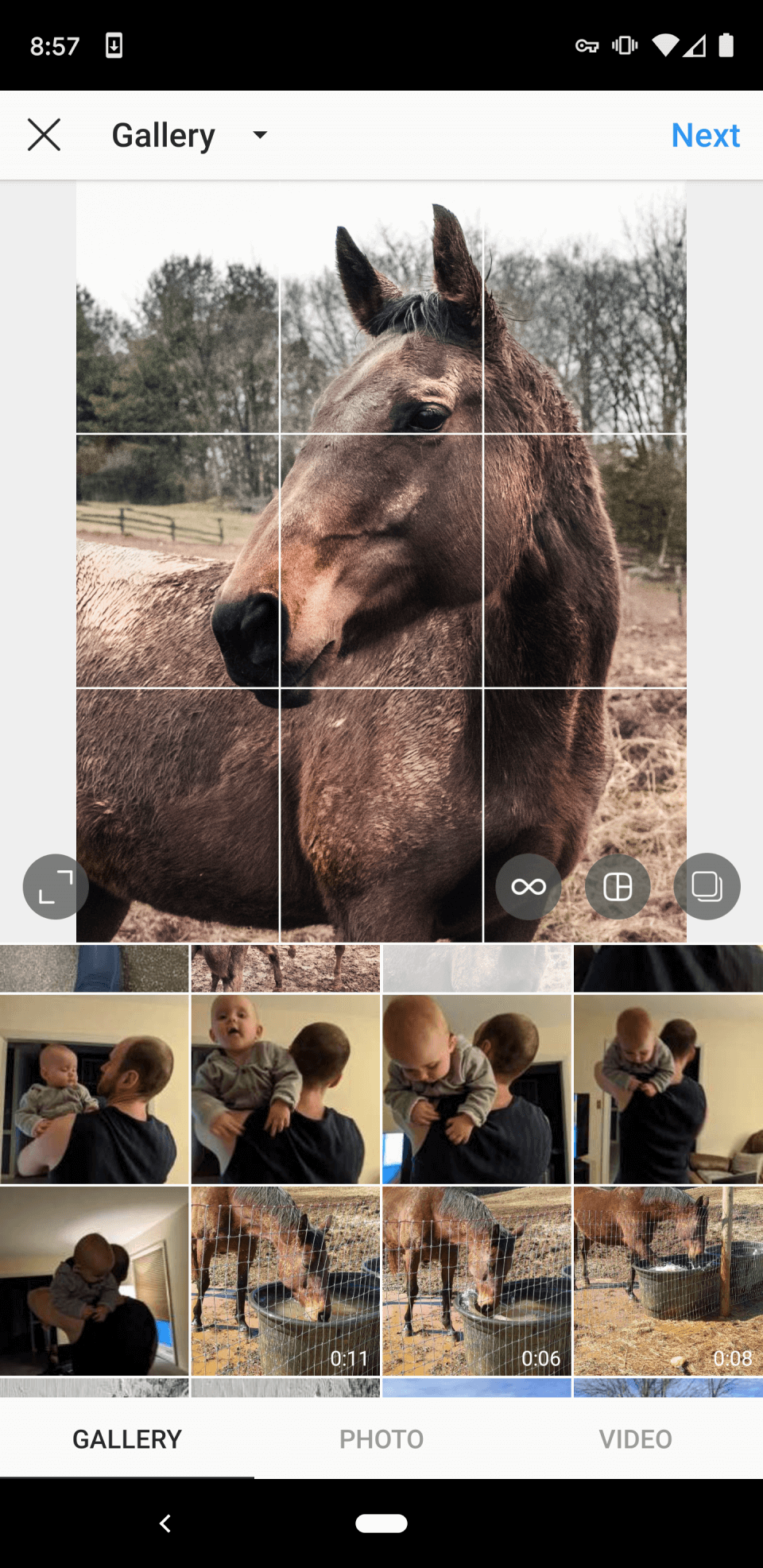
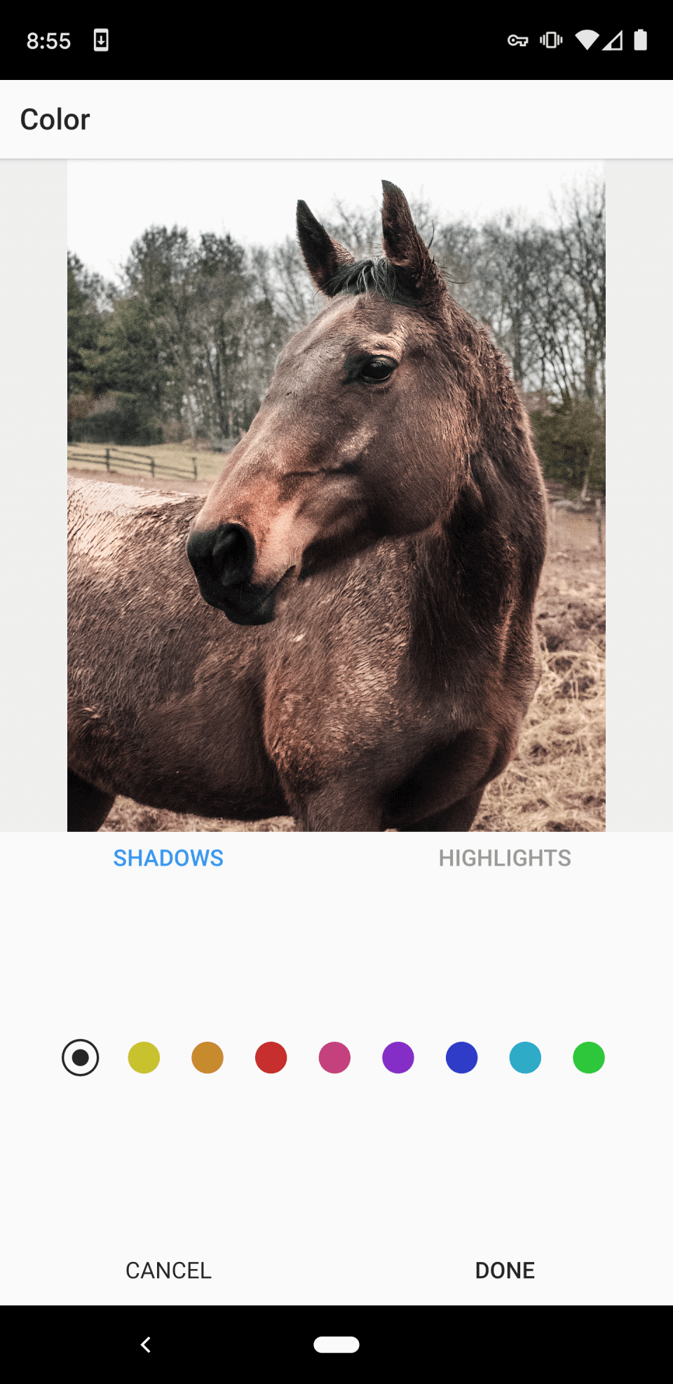
To find it, select “Edit” from the filter screen, and scroll right to “Colors” You will see the screen below on the left. Double click on the color you want, and you will be able to adjust the level of the color. Unless you’re going for something really intense, you’ll want to bring down the color for a more subtle look.
You might be wondering what colors to use. The safest colors are colors that mirror real life – sunlight is yellow, so highlights would be yellow. Shadows are usually blue, so use blue shadows. Alternatively, look at the color wheel. Remember this thing from art class?
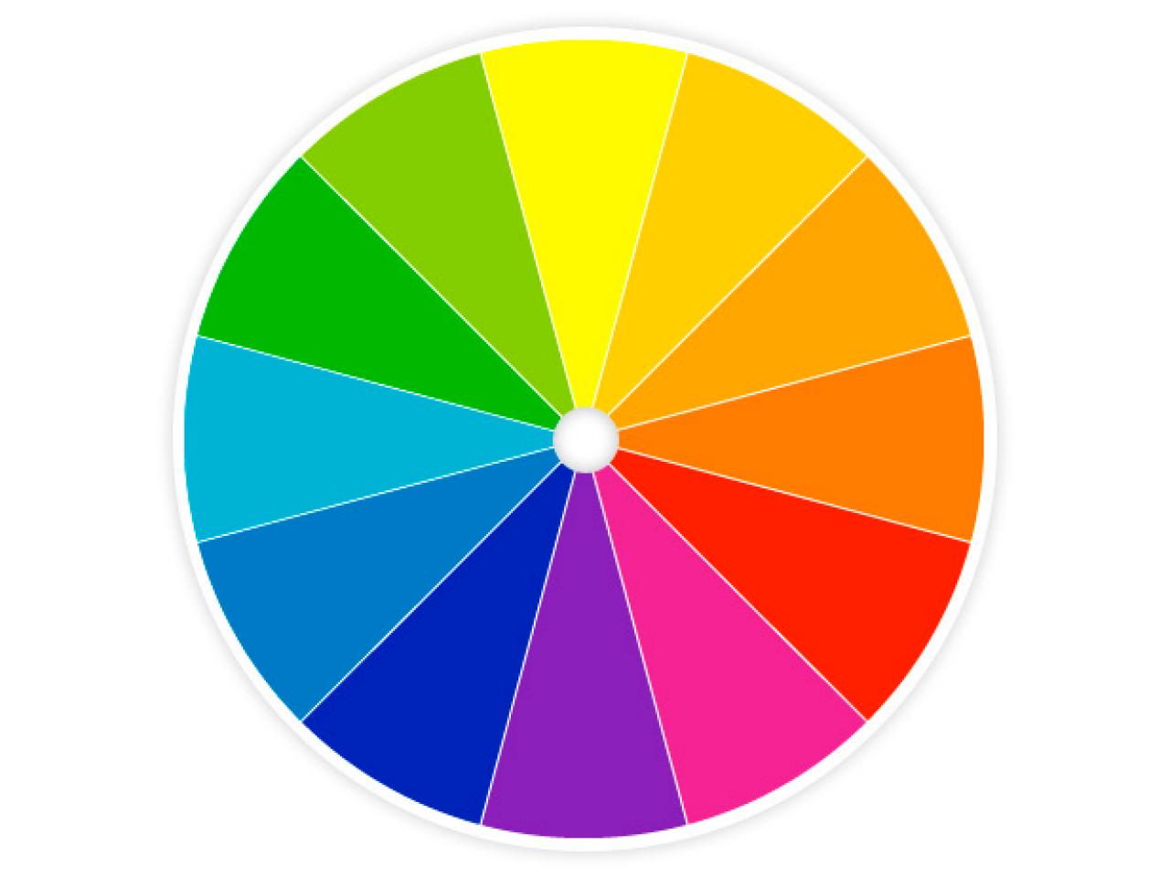
Using complimentary colors usually provides the best effects. That means colors opposite each other on the color wheel.
If you look opposite of yellow, you actually see purple, not blue. Purple could be used, but play around with the shadows to see which will create the look you want. I’ve found that blue fits most daytime photos, while purple is useful for sunset photos. Red shadows can also look very striking on a horse, creating a cinematic style look, so really just play around with it and see what you like.
Another popular choice is orange and teal. Many travel instagrams use this look in their photos. I am usually trying to downplay the orange in my pictures because I am so sick of Virginia clay, but it might provide you with a really neat look for yours.
Here’s an example of the difference split toning can do. Let’s start with an unedited photo of Stu’s big behind.
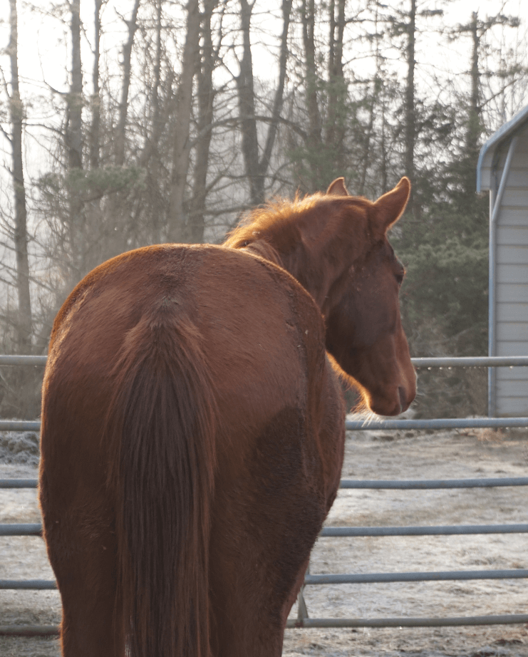
I brought up the exposure slightly, and added some contrast, but did nothing else. Then I added all the split toning below:

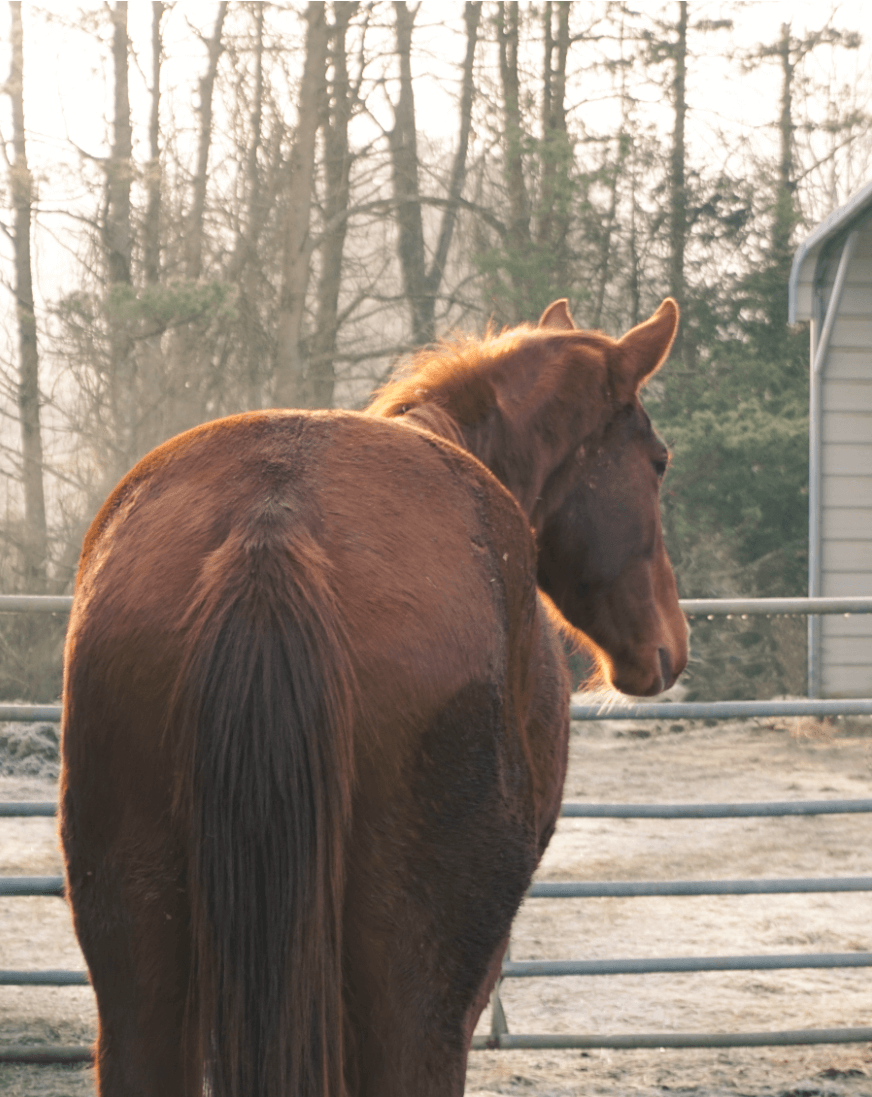

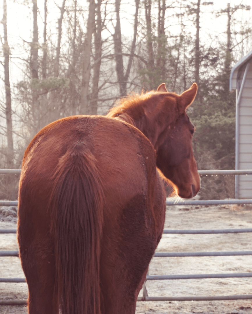
It’s personal preference which one you like the most, but you can see that split toning gives you a variety of ways to customize your photo. And again, this can be done in the Instagram app!
As always, the best way to figure out what you like/don’t like, and gain skill is to just practice at it. I am always trying out new things, which is why I think my feed looks like a mess. But most of the time I’m like a kid in a candy store, learning a new skill, going crazy for it, and then I find something else that I’m excited about. Photography is a very fun hobby, and I am literally learning something new about it every week.
Try these out, and let me know if any of them help you! If you have any questions, I’m happy to help out!